Background:
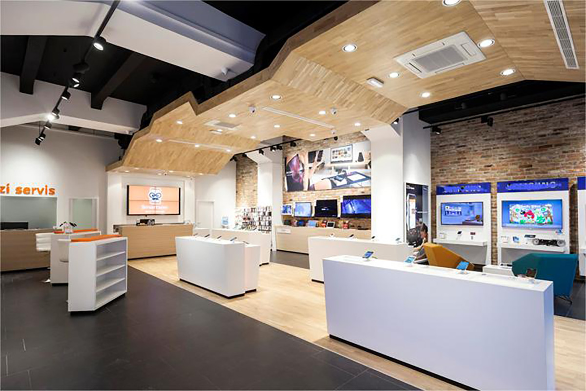
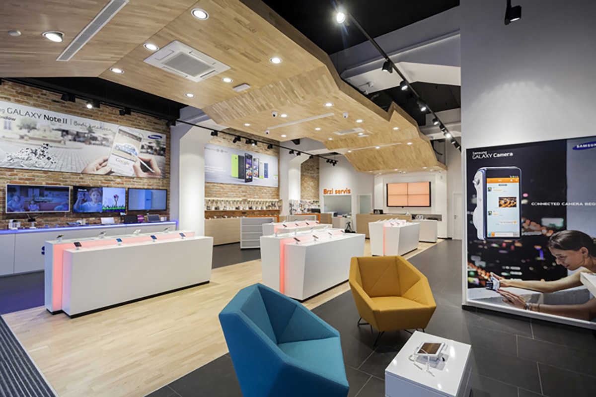
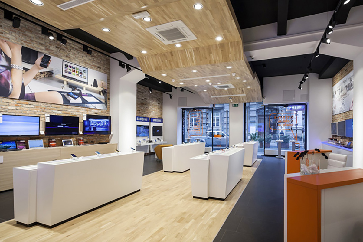
This mobile phone store blends minimalism with a warm, Instagram-inspired design. The client required a layout that supports display, storage, and reception functions, all while maintaining a visually appealing retail atmosphere.
Design Highlights:
-
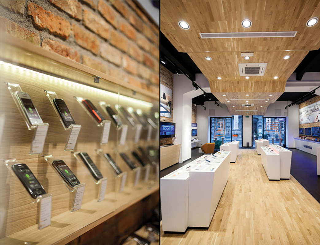
Color Scheme: Dominated by white tones, enhanced by wood grain wall finishes for a natural, cozy vibe.
-
Display Counters: White lacquered counters offer a clean, modern platform for showcasing products.
-
Orange Glow: Integrated orange LED lighting adds warmth and a pop of color, boosting visual impact and social media appeal.
-
Reception Area: Designed with clear flow and accessibility, allowing smooth customer interaction and efficient checkout.
-
Storage: Hidden storage ensures the space remains clutter-free and organized.
Layout Advantage:
The store layout maximizes product visibility, encourages customer movement, and enhances the shopping experience with a clean and inviting atmosphere.
Opening Day